

5 Website Truths for Marketers


Case Study: Banking App
Multiple internal sectors, multiple solutions
Adapting to meet the needs of the masses through research and implementation

Bank of America has a lot of content that isn't particularly accessible or digestible to the average person, business, or investor.
The challenge
This fintech had a bold vision—but needed a brand and product experience to match it.
No clear brand identity or visual system for interactive apps
Existing products lacked UX clarity and polish
Messaging didn’t communicate value to users or investors
Our approach
We helped launch the startup with a confident brand and a user-first product experience.
Built a sleek, trustworthy brand system from the ground up
Designed a mobile-first UI that simplified complex features
Crafted clear messaging to support launch, growth, and funding
user journey mapping
Specialized apps across multiple financial sectors
01
Business needs to access a PDF, video or whitepaper
02
The client reaches out to Bank of America
03
Bank of America responds with proper app containing their sector
04
The app is downloaded or visited on a browser
05
Content is explored and downloaded
Global insights and smart solutions at your fingertip
App 1
Email & Download
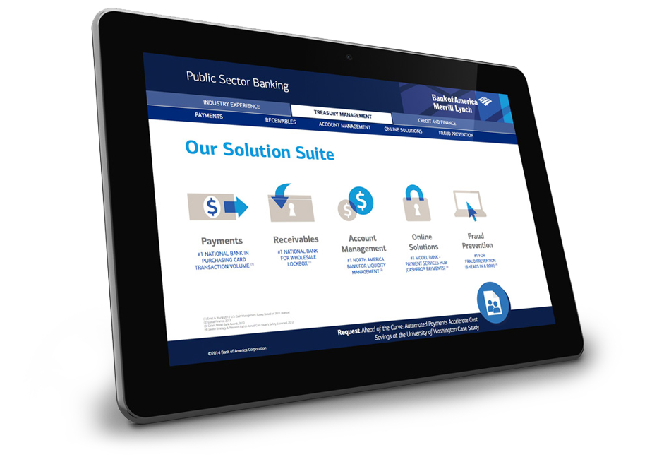
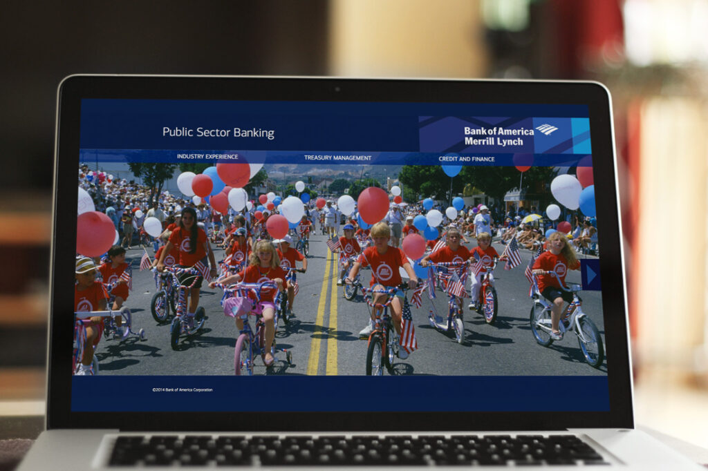
Public Sector Banking
These Bank of America employees were on PCs and were traveling to meet their prospective clients for an in person one-on-one.
They needed a takeaway that could be emailed to their client. It had to have a small file size, viewable on desktop only, and needed to be contained into a single transportable file.
We created this as an interactive PDF with Adobe InDesign
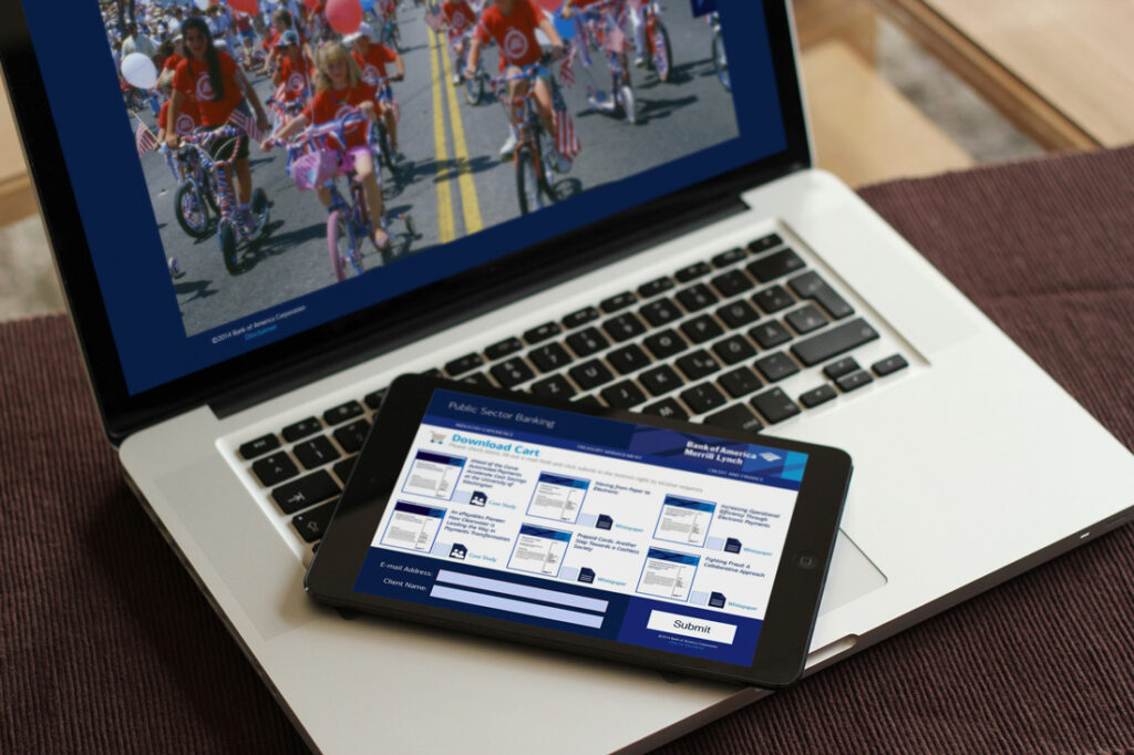
App 2
Analytics & Cache
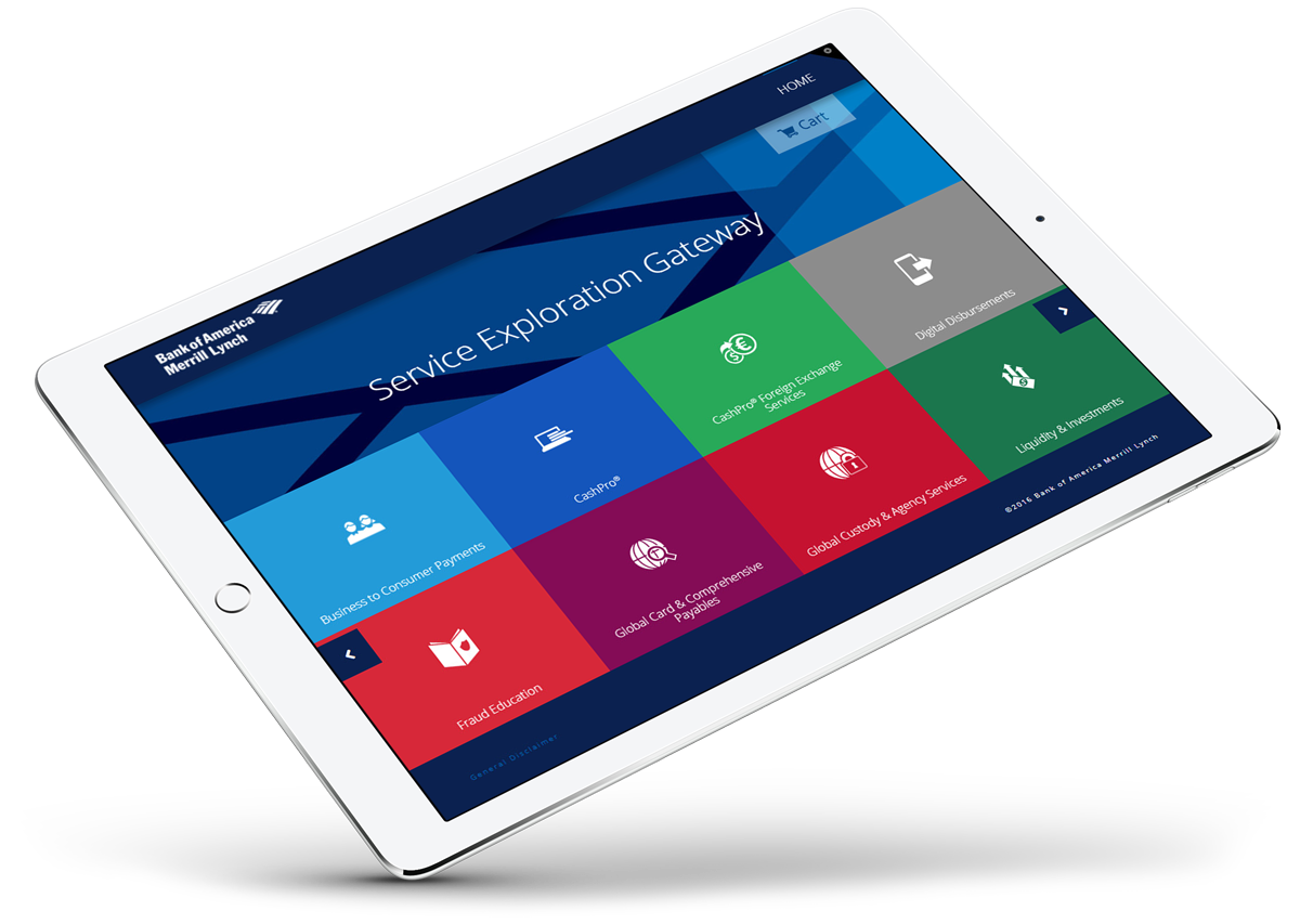
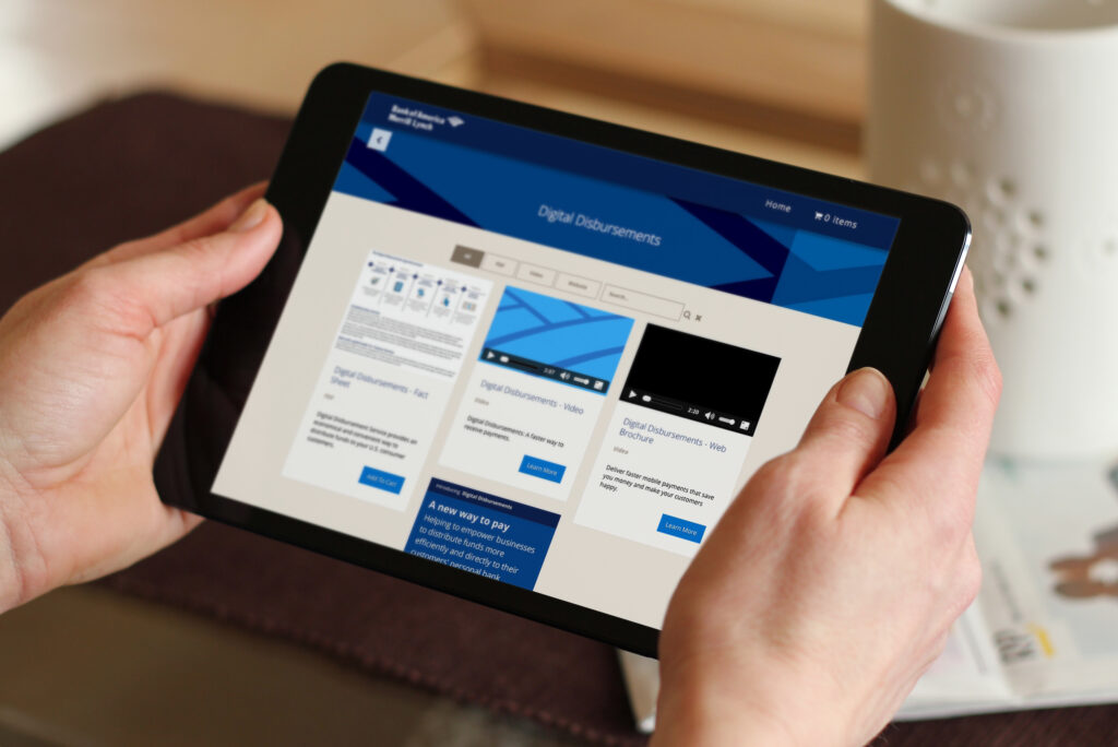
Service Exploration Gateway
This app needed to be viewable on an iPad and desktop. They were unable to download apps on the company iPad so that was out of the question as well.
We decided to do a web app. I put a cache in the header so that it could be stored offline.
The CMS of the app had to be easy to navigate for the client to be able to upload new items as well. It was set up as a simple drag and drop for a PDF as well as a video. The website itself was built with a touchscreen in mind, using large buttons and simple navigation.

Carts are for data
After adding a PDF to their cart and "checking out" the user would be emailed their documents. This allowed Bank of America to have great analytics on the data collection and they were able to reach out to any interested client while knowing exactly what they were interested in.
The main page was a huge menu so the user could dive right into what they wanted.
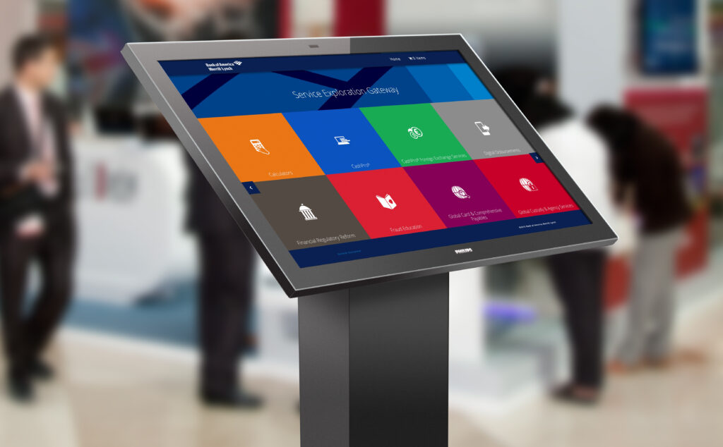
On the road again
We utilized touchscreens at shows and exhibitions throughout the year to show off the website even more. This was top of mind while building.
We made sure to keep the 16x9 ratio responsive in a way to maximize the big display screen. The simple UX and large UI helped customers navigate products easily while using the touchscreen.
App 3
Retirement and Benefit Plan Service App
This app was very similar to the Gateway and the solution to that ended up working great. The Bank of America team needed this app to be left with the client they were pitching to. This was accomplished by sending an invite to the website in an email directed to the future customer.
They were able to get granular analytics on each of their clients with a tracking link on the email to see if they needed to reach back out to them.

3 apps to rule them all
Conclusion
Finding one solution to best fit multiple asks proved to be cumbersome so we chose to ask each stakeholder what they needed. Instead of a one-size-fits-all approach we found it was best to listen to the requests individually. One required it to be emailed, one had to be accessible remotely, and the last required advanced analytics.
In collaboration with:
- Client acquisition: Multi Image Group
- Producer: Multi Image Group
Key outcomes
Cutting edge
A lot of what we wanted to have done, hadn't been done. Researching and producing novel ideas was a must for this set of tasks.
Feedback looped
All three apps had similarities in regards to gaining user information. This was invaluable to the client.
Our work
Creative foundations worth showing off
A look inside the projects where strategy, structure, and design all came together to drive meaningful business outcomes.
- /
- /
- /
- /
Engineering a better customer journey
Full-stack website overhaul, brand repositioning, and marketing funnel enablement for a B2B electrification powerhouse.
View case study

- /
- /
Aprilaire Interactive Product Selector
Customers input their location and get a product reccomendation
View case study
- /
- /
- /
- /
- /
Defining the ATM user experience of tomorrow
Encoding secure financial datathrough the power of soundwaves.
View case study
- /
- /
- /
- /
Sustainable Agriculture
Come to the website to learn, leave with a plant and a mission
View case study
- /
- /
- /
Innovating the future of finance at Mastercard
Transforming ideas into immersive experiences at the annual LAC forum
View case study
- /
- /
- /
- /
Multiple internal sectors, multiple solutions
Adapting to meet the needs of the masses through research and implementation
View case study
- /
- /
- /
- /
- /
Large content into an even larger interactive
A huge document transformed into an exploratory experience
View case study

- /
- /
- /
An edgy website for an established sector
By the people for the people
View case study

- /
- /
- /
- /
Growing an event from concept to execution
Taking Genpact's annual event to new heights with a fresh branding approach
View case study
- /
- /
- /
- /
- /
Gun-safety innovation for humankind
SafeZone enables fingerprint authorization while still having ease of accessibility in times of defense.
View case study