3D product renders to stand out in beauty industry marketing jobs
case study: ATL Freight Website
An edgy website for an established sector
By the people for the people
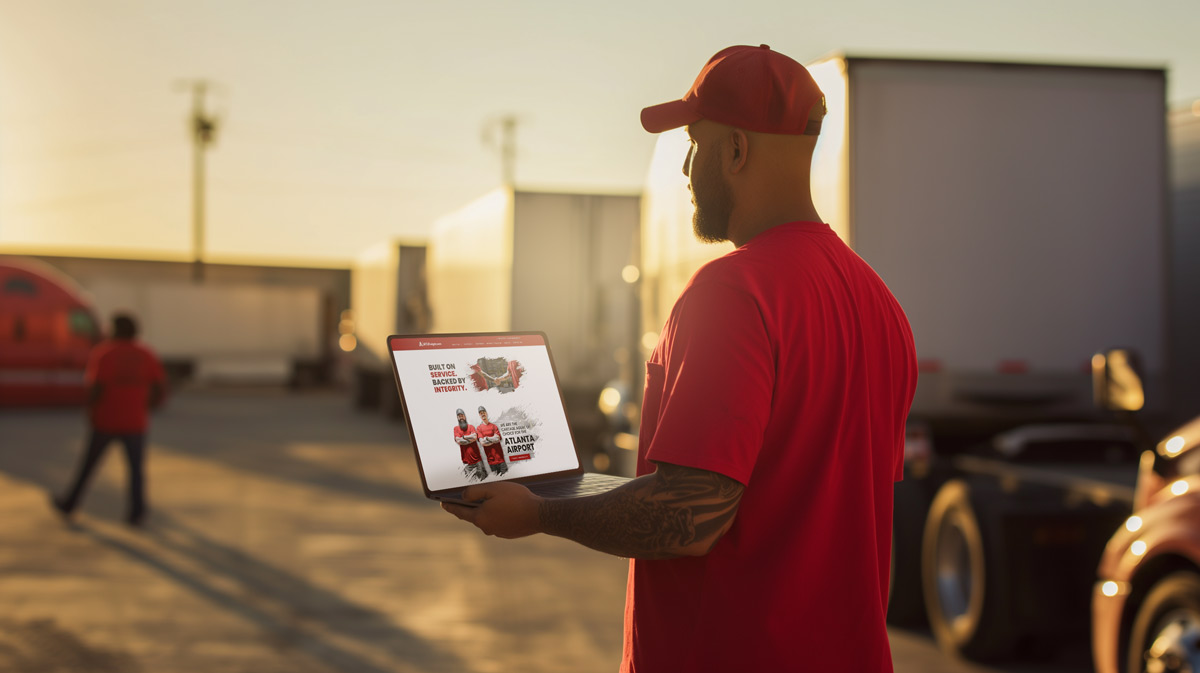

Built on service, backed by integrity.
Hypothesis
Making a website that showcases ATLFreight as a hardworking, dedicated, and far from ordinary company in the freight business.
Approach
- User experience mapping
- User interface design
- Development
user journey mapping
Clean and simple UX, let the pictures do the talking.
One of the east coast’s premier freight companies with a talented and hard-working staff.
One of the east coast’s premier freight companies with a talented and hard-working staff.
Unique & Bold
Homepage
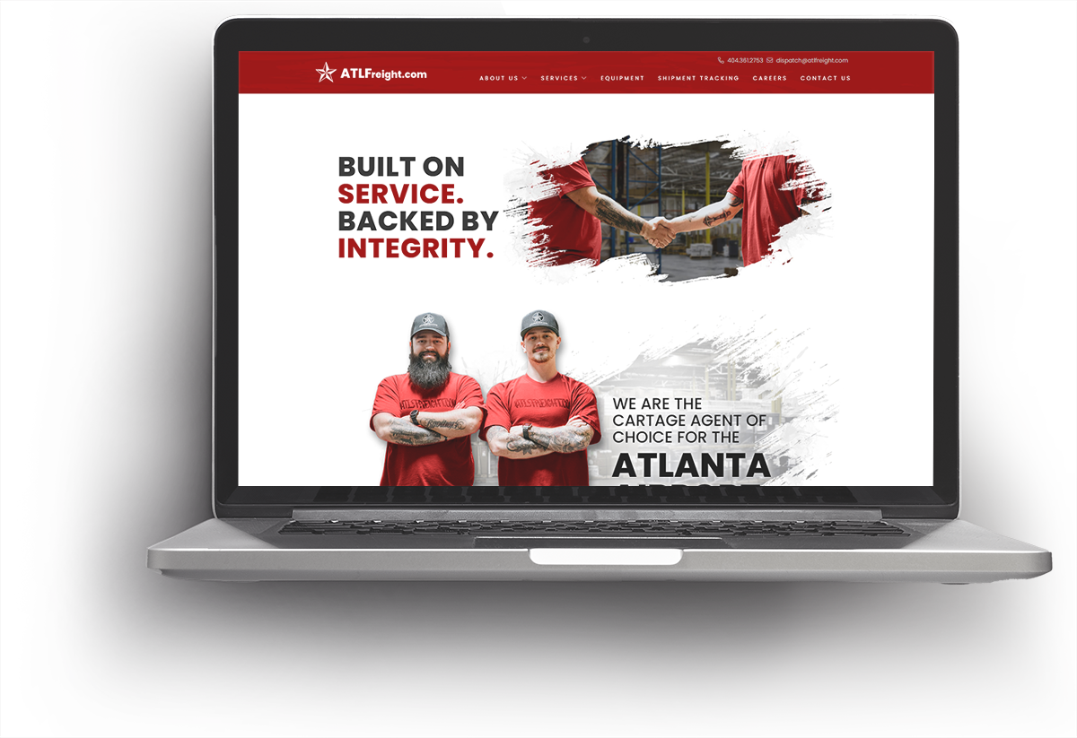
The homepage needs to show the ethos of the company so we decided to use a big tagline. The grunge look was used to tie the entire site together.
We designed it to be a cut-out in order to keep as much white space as possible. This allowed the sharp lines and color contrast to draw the eye. The site was meant to be unique among the freight industry, breaking the norms and really showing the culture of ATLFreight.com
Callouts & Page Breaks
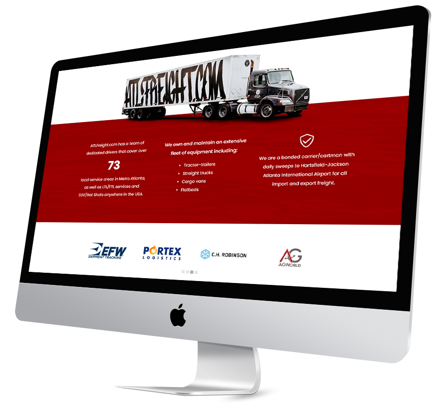
Part of the website needed more direct attention, mostly pertaining to important numbers or other services that made them stand apart from the competition. For these areas, we programed a parallax red background.
Grunge & animations
We made a grunge look into a slightly opaque PNG and set that over the red background., When scrolling the PNG would shift slightly on the vertical axis which gave the site a subtle animation effect.
We programmed an animating carousel for the client logos as well as the testimonials. These simple animations give the homepage a customized look and bring this site up to date.

final outcome
A look you wanna rock.
Conclusion
Working with the wonderful ATLFreight team and the fantastic Nancy Trowbridge, who did a lot of work as the producer, we met all of the goals and everyone was happy with the end result. The website got many compliments from team members as well as their clientele.
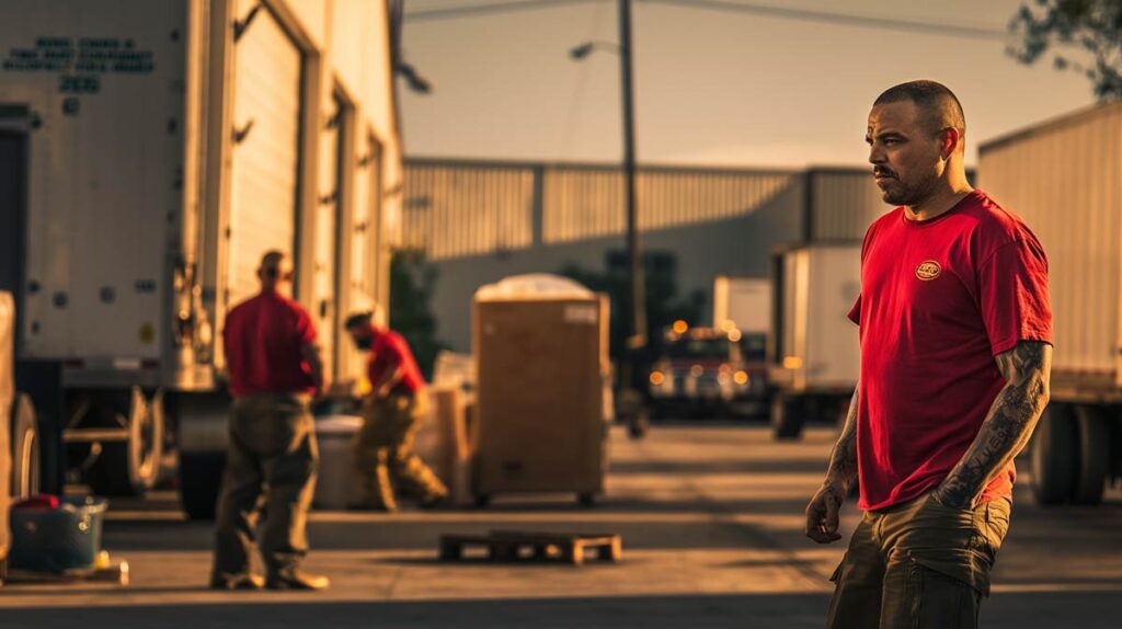
The photographer, Kandace Ventura, really pulled the site together with absolutely stunning imagery.
Key outcomes
A unique style
ATLFreight wanted the site to showcase that they are far from cookie-cutter. Their employees are themselves and they want to keep it that way while showing the world who they are.
In collaboration with:
- Client acquisition: Nancy Trowbridge
- Photographer: Kandace Ventura
There's more where this came from

Are you our next success story?
Let’s work together to set you apart
