5 Website Truths for Marketers
Case Study: Aprilaire Product App
Aprilaire Interactive Product Selector
Customers input their location and get a product reccomendation

Aprilaire needs an attractive and easy-to-use app to pair customers with their vast array of products as well as inform their team of the potential sale.
The challenge
AprilAire had a trusted product but lacked a digital presence that resonated with modern homeowners and professionals.
Outdated design that didn’t reflect product quality
Confusing site architecture made it hard to find information
No clear brand story or emotional connection
Our approach
We modernized AprilAire’s digital experience to match its reputation and drive user trust.
Refreshed the brand with a clean, health-focused aesthetic
Reorganized site structure for easier navigation and discovery
Clarified messaging to connect with both homeowners and pros

user journey mapping
The product you need, curated at your fingertip
01
Customer opens app to learn which product best fits their needs
02
The customer chooses their geographical location
03
The customer chooses the climate in their region
04
Products are shown based on the inputs from 2 and 3
05
Product is chosen and added to cart
06
Customer clocks checkout
07
Customer fills in contact information
08
Contact information is sent to online database for sales lead

Aprilaire produces machines to turn air clean. They specialize in humidifiers, dehumidifiers, air filters, and more.
Goals
Education
The customer will learn which products are offered directly correlating to region and climate.
Leads
A qualified lead is gathered with key sales information of exactly which product is needed.
The app should be based on visuals and simple layouts to gamify and not overwhelm the user. We will include a progress bar to not intimate the user and provide a visual end goal to their user journey.


Gamification
The home screen features a scratch-off type game to lure users into discovering facts. After all of the numbers are revealed it is programmed to progress to the next slide that features a simple explanation of Aprilaire.
Geography & Filtering
The apps key feature revolves in it having a customized experience based on region. One of the first things is to choose which area the customer is going to utilize the product. Instead of a dropdown and text-based selection, I chose to have a visual map. Once an area is clicked it changes to show that region.
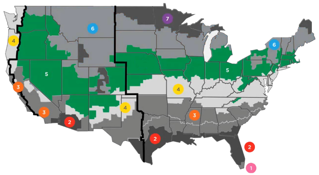

Geographical Plotting
The backend consists of an excel database linked to specific products. All products are live in the background. As the user progresses through the initial forms the database is reordered and hides products that would not be applicable to their geographic region. This narrows down the choices and provides a cleaner and easier product exploration page
Products & Cart
Now that the customer has gone through the process of selecting their environment the customized product page is shown. You can view more details once you tap the product of your choosing.
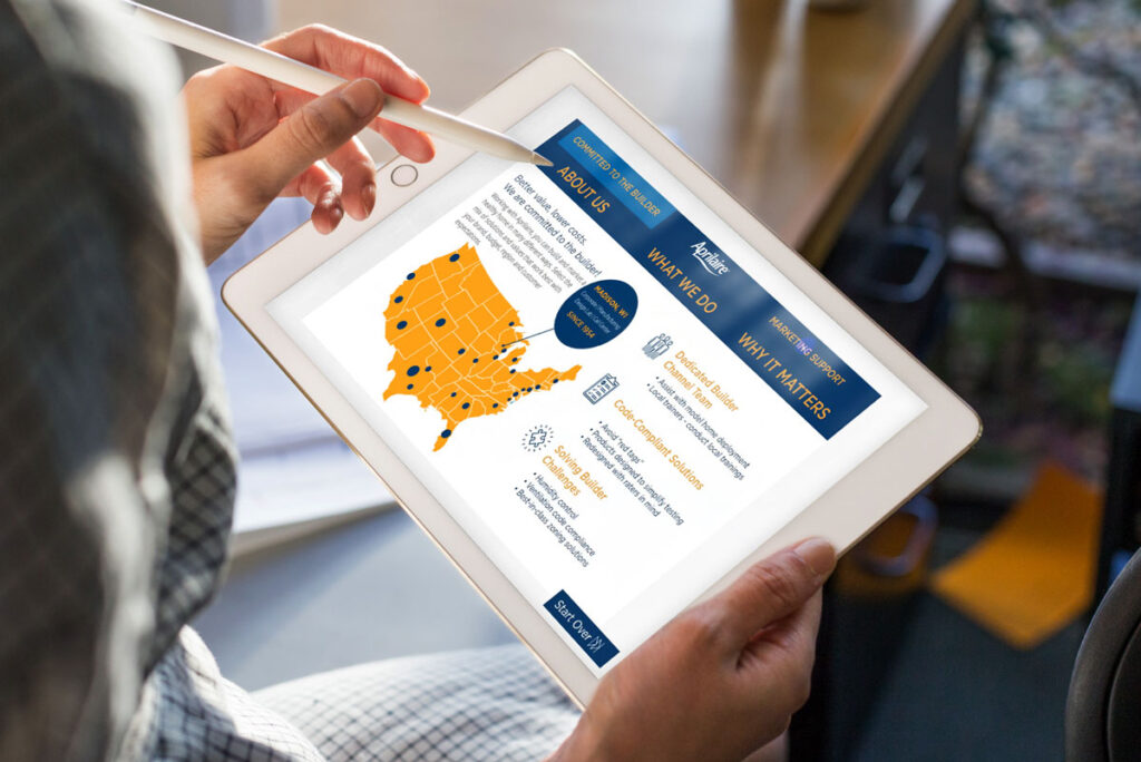

Product Selection
Adding the products to your cart will add them into a database while browsing. After the user fills in their email information it links their contact to the items they are interested in. Upon completion, it brings them to a more detailed page explaining Aprilaire.
Data & ROI
The database is connected to an online API emailer that will send an email to the client with the potential customer's name and products chosen. A sales representative can reach out to the customer and walk through the products, what they offer and how they can benefit their house or construction project.
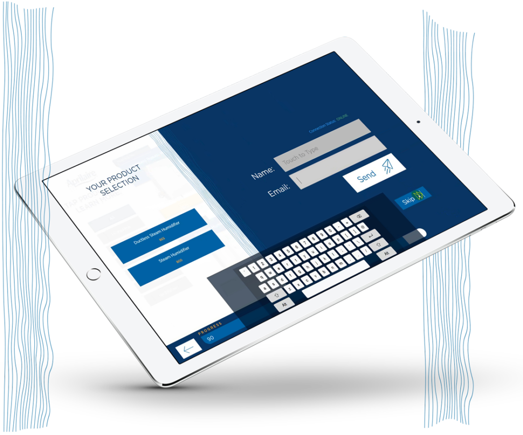
A vision realized
Conclusion
As the curtains fell on Grow18, the success of the event was etched not just in the memories of those who attended, but in the tangible outcomes that followed. Attendees left engaged, through interactive installations and digital interfaces registering high participation levels, indicating a deeper connection with the content and brand. Secondly, post-event feedback highlighted an unprecedented appreciation for the immersive brand experience, leading to an enhanced perception of Genpact as not just a corporate entity, but as a beacon of innovation and transformation in the industry. These outcomes not only reflect the fruition of our creative endeavors but also set a new benchmark for Genpact's future corporate events.
Key outcomes
Increased engagement
Through interactive experiences, conversations were sparked, connections were deeper, and otherwise passive viewing turned into active experiencing.
Quality perception
Our work
Creative foundations worth showing off
A look inside the projects where strategy, structure, and design all came together to drive meaningful business outcomes.

